When founders and business leaders set out to establish a new brand or modernize an existing company, the conversation almost always starts with a logo. They invest significant time debating emblem concepts, icon shapes, and typography. Yet, after finalizing the logo, they often find that their marketing collateral, proposals, social media posts, and website still feel disconnected, amateur, or inconsistent.
The reason is simple: a logo is not a brand identity. A logo is merely a signature mark—a recognizable anchor point. What truly shapes customer perception, instills trust, and establishes commercial credibility is the comprehensive visual ecosystem supporting that logo across every customer touchpoint.
Professional visual branding is an interconnected design system. When executed with precision, it signals competence, stability, and attention to detail before a prospect ever reads a single line of your sales copy. Below are the 9 fundamental visual design elements that elevate a business beyond a basic logo and make it look undeniably professional.
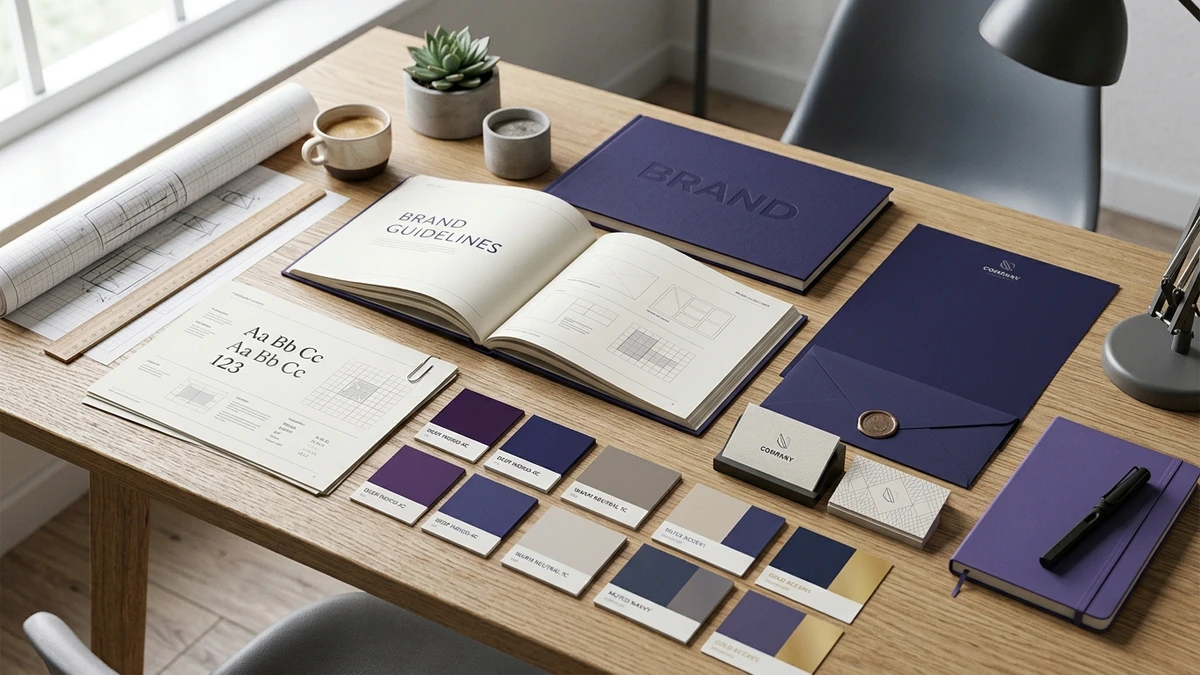
1. A Defined, Disciplined Color System
Amateur branding frequently relies on arbitrary color choices, using random shades across different documents and web pages. A professional brand operates on a structured color palette with defined roles and mathematical contrast rules:
- Primary Brand Colors (60%): The dominant tone that establishes brand recognition and overall personality.
- Secondary Supporting Colors (30%): Neutral tones (slates, off-whites, charcoal grays) that create clean background contrast and readable surfaces.
- Accent / Action Colors (10%): A high-contrast accent reserved exclusively for calls to action, highlights, and critical conversion triggers.
Maintaining exact HEX, RGB, and CMYK color codes across both digital screens and physical print ensures immediate brand coherence.
2. Intentional Typography Hierarchy and Font Pairing
Typography communicates tone long before words are processed. Businesses that use four different fonts, mismatched weights, or default system typefaces immediately appear fragmented and unpolished.
A mature design system establishes a strict typographic scale:
- Primary Display Font: Used for primary headlines (H1/H2) to project character, authority, and modern appeal.
- Body Text Font: Highly legible, neutral sans-serif or serif typography optimized for extended reading comfort across desktop and mobile screens.
- Scale & Line Heights: Standardized sizing ratios (e.g., 1.25x or 1.33x scale) and balanced line-heights (1.4 to 1.6) that prevent dense, unreadable text walls.
3. Spatial Grid Systems and Visual Hierarchy
One of the most immediate differentiators between amateur and professional design is the use of whitespace and grid alignment. Inexperienced designers often feel compelled to fill every pixel with graphics or text, resulting in visual clutter that overwhelms prospective buyers.
Professional design employs consistent 8-point or 12-column grid frameworks. Generous whitespace around key headings, cards, and value propositions directs the visitor's eye naturally toward the most critical business information without cognitive strain.
4. Curated Imagery, Photography Guidelines, and Art Direction
Generic, staged stock photos—such as overly smiling models in pristine suits shaking hands in an empty boardroom—immediately erode authenticity. Today's discerning buyers recognize synthetic stock imagery within milliseconds.
A professional visual identity defines clear art direction guidelines: authentic workspace photography, candid team interactions, cohesive lighting tones, and tailored image color grading that complements the brand's primary palette.
5. Custom, Cohesive Iconography
Icons are essential visual shortcuts for summarizing complex features and capabilities. However, mixing mismatched icon sets—such as combining thin outline line-icons with thick colorful filled 3D graphics on the same page—creates visual discord.
Professional agencies craft or curate unified icon systems with consistent stroke weights, corner radiuses, badge backgrounds, and padding rules that seamlessly integrate with your creative design and branding assets.
6. Proprietary Graphic Shapes, Patterns, and Visual Motifs
Think of the most memorable global brands: you can easily identify them even when their logo is hidden, thanks to distinct secondary design motifs (such as subtle geometric gradients, angled divider lines, bespoke container shapes, or stylized container pill badges).
Developing secondary graphic elements gives your marketing materials an unmistakable visual signature across pitch decks, whitepapers, and display banners.
7. Structured Layout Consistency Across Documents and Decks
From client proposals and invoice templates to PDF case studies and executive slide decks, your layout structure must feel like parts of the same cohesive publication. Inconsistent margin spacing, shifting header placements, and mismatched bullet styles signal internal disorganization to prospective enterprise clients.
Standardized document master templates ensure that every piece of communication leaving your office reinforces executive quality.
8. Unified Social Media Templates and Digital Footprints
Social media is often the first touchpoint where potential clients and partners encounter your brand. When social post graphics look ad-hoc—using different fonts and colors on every post—the business appears unfocused and inconsistent.
Implementing branded social media templates through strategic social media marketing and optimization ensures that carousels, announcement cards, quote highlights, and video thumbnails maintain a recognizable brand aesthetic on every feed.
9. Seamless Website Visual Consistency and Design System
Your website is the digital headquarters of your company. If your website's UI elements—buttons, cards, badges, dropdowns, and form fields—diverge from your physical branding or social identity, visitors experience cognitive dissonance.
By engineering your web presence using modern website design frameworks, you establish reusable component libraries (CSS design tokens, button states, and elevations) that ensure flawless responsive consistency across every screen size.
The True Value of a Comprehensive Brand Guidelines Document
The glue that holds all these design elements together is a living Brand Guidelines document (Brand Style Guide). A standard guidelines package outlines:
- Logo clearance zones, minimum sizes, and improper usage rules
- Color palettes with exact color codes (HEX, RGB, CMYK, Pantone)
- Typography specifications, weights, fallbacks, and hierarchy rules
- Iconography style rules and graphic asset libraries
- Photography tone, treatment, and composition standards
- UI component specifications and voice-and-tone principles
Practical Checklist: Evaluating Your Visual Identity Health
Review your current brand assets against this 5-point audit:
- The Squint Test: If you blur your eyes, does your website or document clearly guide the eye to one focal point?
- The Logo-Removal Test: If you remove your logo from a brochure or social post, can someone still tell it belongs to your company?
- The Mobile Audit: Do your brand colors, typography, and card layouts retain their elegance on a 375px smartphone screen?
- The Cross-Channel Match: Does your LinkedIn banner, website hero, pitch deck, and invoice template feel like they were created by the same design team?
Frequently Asked Questions (FAQ)
Why is a logo alone not enough to build a brand?
A logo is simply an identifier mark. It does not dictate how your website feels, how legible your proposals are, how trustworthy your marketing collateral appears, or how consistently your brand communicates across digital channels.
How many colors should a business brand palette contain?
Most successful brand design systems use 3 to 5 core colors: one primary brand color, one or two neutral supporting shades (for text and background readability), and one high-contrast accent color reserved for calls to action.
Can a small business look as professional as an enterprise corporation?
Yes. Visual professionalism is not determined by company size or budget—it is determined by design discipline, layout consistency, typography hierarchy, and adherence to clean design guidelines.
What is the difference between brand identity and brand strategy?
Brand strategy defines your business positioning, audience, value proposition, and voice. Brand identity is the tangible visual system (colors, typography, layout, imagery) that translates that strategy into human perception.
How often should a company update its visual design elements?
Core brand identities should be built to last 5 to 10 years. However, digital design systems, UI components, and social templates should be continuously refined to adapt to evolving screen resolutions and modern web standards.
Elevate Your Brand's Digital Presence with Digitons
At Digitons Development, we craft bespoke visual identities and digital design systems that build authority, enhance user trust, and scale commercial performance. If your business is ready to move beyond a simple logo and build a world-class brand, contact our brand design team today to start your visual transformation.
Ready to turn these ideas into results?
Let's discuss how tailored digital marketing, custom web engineering, and targeted SEO can accelerate your business goals.